Why is Flexbox needed?
The developers had used the tables, float, inline and other elements to create the layouts. The flexbox module is a w3C last call working Draft. Flexbox helps us to aims at providing a more efficient way to layout, align and distribute space among items in a container, even when their size is unknown or dynamic. Flexbox also helps us to arrange the alignments or layout based on different screen size. Many developers are would find the usage of flexbox are very easy and like to use to create the layouts.
Power of Flexbox.
Below are the main points or concepts which make the flexbox being powerful.
Declare FlexBox. It enables a flex context for all its direct children.
.flex-container {
display: flex;
}
flex-direction
.flex-container {
flex-direction: row | row-reverse | column | column-reverse;
}
flex-wrap
.flex-container{
flex-wrap: nowrap | wrap | wrap-reverse;
}
nowrap (default): single-line / left to right
wrap: multi-line / left to right
wrap-reverse: multi-line / right to left
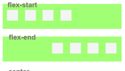
Justify-content
We can align the content (flex-item ) inside the flex container in the following way.
.flex-container {
justify-content: flex-start | flex-end | center | space-between | space-around;
}
Order
.item {
order: number;
}
We can say the order of the flex item, especially for some screen width or conditions. Please see the image below for a more clear idea.
Browser Support
The Flexbox has only limited support. But the good thing is that it will be work in all modern browsers. Please check the browser support for the flexbox here.
References Resources


Leave a Reply