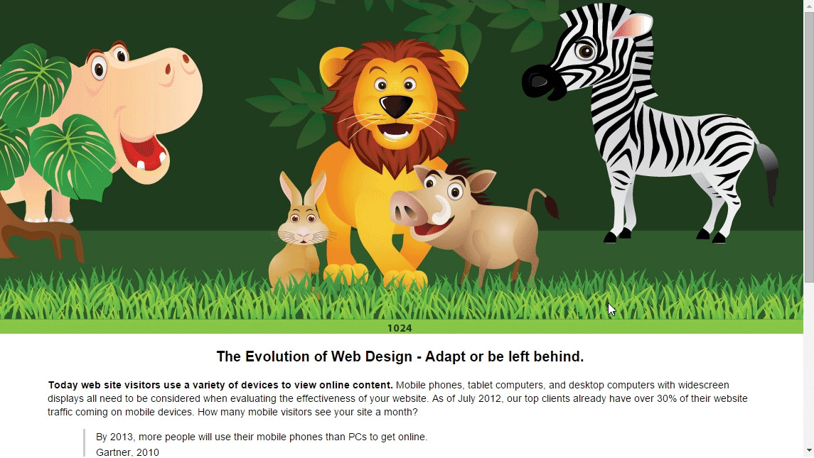
Adaptive Web Design: Adaptive Web Design is constructed for a variety of screen sizes such as desktop, tablet and mobile phones. A particular layout is activated when the screen size of the device viewing the website is detected and matched with a style sheet. The main feature of Adaptive Web Design is as follow.
a. It has a relative widths
b. It also uses the fixed width and with device & resolution driven media queries.
c. You have requirements that are radically different between different devices.
d. You have a sufficient diversity of devices that you can justify different templates.
e. You can design templates that cumulatively deliver more benefit than having a one-size-fits-all solution.
f. You have sufficient resource to maintain and develop different templates (and know that the resource is best spent working on multiple templates, instead of new, universal, functionality). Please click on the below image and reduce your browser width to see the Adaptive Web Design Example.
Responsive Web Design: Responsive Web Design is responsive to any screen sizes. With the use of media queries, you can create a flexible grid where text can wrap and images can shrink to adjust along with your browser. The main feature of Adaptive Web Design follows.
a. Responsive videos, images, EM units instead of pixels.
b. It has a relative widths
c. Content & design driven with media queries.
Responsive web design is becoming more important as the amount of mobile traffic now accounts for more than half of the total internet traffic. This trend is so prevalent that Google has begun to boost the ratings of sites that are mobile-friendly if the search was made from a mobile device. This has the net effect of penalizing sites that are not mobile-friendly. Please click on the below image and reduce your browser width to see the Responsive Web Design Example.


Leave a Reply