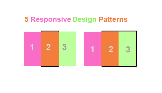
1.Mostly fluid:
On large or medium devices, it usually remains the same size, but adding the margin to right and left on wider screens.
On smaller screens, the grid causes the main content to reflow, while columns are stacked vertically. The main advantage of this pattern is that it usually only requires fewer breakpoints between small screens and large screens.
2.Off-canvas:
Rather than stacking content vertically, the off-canvas pattern places less frequently used content, perhaps navigation or app menus off-screen, only showing it when the screen size is large enough, and on smaller screens, content is only a click away.
3.Column Drop:
For full-width multi-column layouts, column drop simply stacks the columns vertically as the window width becomes too narrow for the content. Eventually, this results in all of the columns being stacked vertically. Choosing breakpoints for this layout pattern is dependent on the content and will change for each design.
4.Layout shifter:
The layout shifter pattern is the most responsive pattern, with multiple breakpoints across several screen widths. The key to this layout is the way content moves about, instead of reflowing and dropping below other columns. Due to the significant differences between each major breakpoint, it is more complex to maintain and likely involves changes within elements, not just the overall content layout.
5.Tiny tweaks:
Tiny tweaks simply make small changes to the layout, such as adjusting font size, resizing images or moving content around in very minor ways.
Courtesy: Udacity


Leave a Reply